Color Psychology Explained: How Bedroom Curtain Colors Influence Your Sleep Quality

Mar 27 2026
Sleep is one of the most important pillars of human health, yet millions of people struggle with falling asleep, staying asleep, or waking up feeling refreshed. While many factors influence sleep quality—mattress comfort, lighting, temperature, and daily habits—one often overlooked element plays a surprisingly powerful role: the color of your bedroom curtains.
Curtains are not merely decorative accents. They shape the atmosphere of a room, regulate light exposure, influence emotional responses, and subtly guide the body’s internal clock. Through the lens of color psychology, curtain tones can either promote deep rest or quietly disrupt sleep patterns night after night.
In this comprehensive guide, we’ll explore how bedroom curtain colors affect sleep quality, the science behind color perception, and how to choose shades that support relaxation, circadian rhythm balance, and long-term well-being.
Why Bedroom Color Matters More Than You Think
Color psychology studies how colors influence human emotions, behavior, and physiological responses. The brain processes color faster than conscious thought, meaning your environment begins affecting your mood the moment you enter a space.
In bedrooms, this effect becomes even stronger because:
- The brain associates the room with rest and recovery.
- Lighting conditions shift dramatically between day and night.
- Visual stimulation directly impacts melatonin production.
- Emotional comfort determines how quickly you relax.
Curtains occupy a large visual surface area, often covering entire walls. Because of this, their color has a greater psychological impact than smaller decorative items like pillows or artwork.
The Science Behind Color and Sleep
Before choosing curtain colors, it helps to understand how sleep works biologically.
The Role of Circadian Rhythm
Your circadian rhythm is a 24-hour internal clock controlled largely by light exposure. When light enters the eyes, signals travel to the brain’s suprachiasmatic nucleus, regulating hormones such as:
- Melatonin (sleep hormone)
- Cortisol (alertness hormone)
- Serotonin (mood stabilizer)
Colors influence how light is perceived and reflected within a room, indirectly affecting these hormonal cycles.
Emotional Regulation and Color Perception
Different wavelengths of light trigger different neurological responses:
- Cool tones slow heart rate.
- Warm tones increase stimulation.
- Neutral tones reduce cognitive load.
A bedroom designed with calming colors encourages the nervous system to shift from alert mode into restorative mode.
How Curtains Specifically Affect Sleep
Unlike wall paint, curtains interact dynamically with natural and artificial light.
They control:
- Light filtering
- Color reflection
- Visual softness
- Privacy perception
- Thermal comfort
Morning sunlight filtered through colored fabric casts subtle hues across the room, shaping how your brain interprets the start of the day.
At night, curtain tones influence how artificial lighting feels—either soothing or energizing.
Best Curtain Colors for Better Sleep
Let’s examine the most sleep-friendly curtain colors and why they work.
Soft Blue: The Ultimate Sleep Color
Blue consistently ranks as one of the most calming colors in psychological studies.
Why Blue Works
- Associated with sky and water
- Lowers blood pressure
- Reduces heart rate
- Signals safety and stability
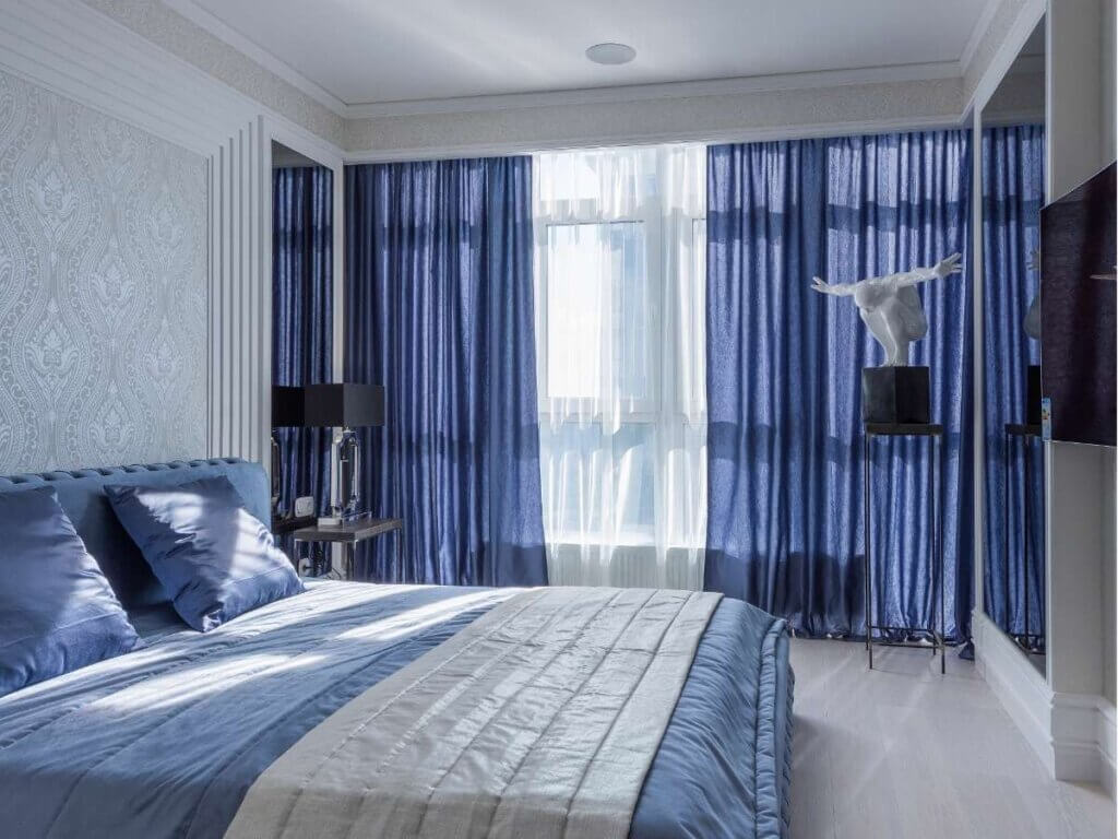
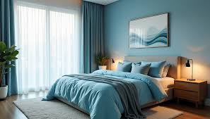
Soft blue curtains create a tranquil environment that encourages mental slowing before bedtime.
Best Shades
- Dusty blue
- Powder blue
- Muted navy
- Blue-gray
Avoid overly saturated electric blues, which can feel stimulating.
Gentle Green: Nature’s Restorative Tone
Green sits at the center of the visible color spectrum, making it easy for the eyes to process.
Sleep Benefits
- Reduces visual fatigue
- Promotes emotional balance
- Evokes natural environments
- Supports stress recovery
Green curtains are particularly effective in urban environments where natural scenery is limited.
Ideal Variations
- Sage green
- Olive green
- Moss green
- Soft eucalyptus tones
These shades subtly recreate the calming influence of nature indoors.
Warm Neutrals: Comfort Without Stimulation
Neutral tones provide psychological stability without overwhelming the senses.
Popular options include:
- Beige
- Warm ivory
- Taupe
- Sand tones
These colors reflect light softly, preventing harsh brightness while maintaining warmth.
Neutrals work especially well in minimalist or modern bedrooms.
Lavender and Soft Purple: Quiet Relaxation
Light purple tones combine the calmness of blue with the warmth of red.
Studies suggest lavender hues may:
- Reduce anxiety
- Encourage relaxation
- Improve pre-sleep mood
Choose muted versions rather than vibrant purple to avoid overstimulation.
Soft Gray: Modern Calm
Gray has evolved into a popular bedroom color due to its adaptability.
When chosen correctly, gray curtains:
- Reduce visual clutter
- Enhance softness of lighting
- Create cocoon-like comfort
Best choices include warm gray or greige rather than cold industrial tones.
Curtain Colors That May Harm Sleep Quality
Not all colors belong in a sleep-focused environment.
Bright Red: High Energy Activation
Red increases:
- Heart rate
- Blood pressure
- Emotional intensity
While dramatic and stylish, red curtains can subconsciously keep the brain alert.
Better suited for dining rooms or social spaces.
Vibrant Orange: Stimulating and Energizing
Orange promotes enthusiasm and activity—great for gyms or creative spaces but not ideal for winding down.
Even filtered light through orange fabric can feel energizing rather than calming.
Bold Yellow: Too Much Morning Energy
Yellow reflects large amounts of light, increasing brightness levels.
While cheerful during the day, intense yellow may:
- Cause eye strain
- Increase restlessness
- Interfere with evening relaxation
Soft buttery tones are safer than saturated yellows.
Pure Black Without Balance
Blackout curtains are excellent for darkness control, but pure black fabric can feel heavy or emotionally dense if not balanced with lighter décor.
Consider charcoal or layered curtains instead.
The Role of Fabric and Texture in Color Perception
Color alone does not determine psychological impact. Fabric texture changes how color behaves.
Matte Fabrics
- Absorb light
- Create softness
- Reduce glare
- Feel calming
Best for sleep-focused rooms.
Glossy Fabrics
- Reflect light strongly
- Increase visual stimulation
- Add formality
Less ideal for restful environments.
Natural Textiles
Linen and cotton diffuse light gently, enhancing calming color effects.
Light Filtering vs. Blackout: Color Interaction Matters
Curtain function dramatically changes how color affects sleep.
Sheer Curtains
- Allow daylight diffusion
- Create gentle color ambiance
- Ideal for layered designs
Blackout Curtains
- Block light completely
- Support melatonin production
- Essential for shift workers or urban homes
Combining sheer inner panels with calming-colored blackout curtains offers the best balance.
Matching Curtain Color to Bedroom Orientation
Room direction influences how colors appear throughout the day.
North-Facing Rooms
Receive cooler light.
Best curtain colors:
- Warm neutrals
- Soft beige
- Warm gray
These counteract cold lighting.
South-Facing Rooms
Bright and warm naturally.
Ideal colors:
- Blue
- Green
- Muted gray
These maintain visual balance.
East-Facing Bedrooms
Strong morning sunlight.
Use:
- Soft blue
- Sage green
- Light gray blackout layers
Helps soften early brightness.
West-Facing Bedrooms
Warm evening light.
Choose cooler tones to prevent overstimulation before bedtime.
Cultural and Emotional Associations with Color
Personal experience influences color response.
For example:
- Blue may feel peaceful to some but cold to others.
- Beige may feel comforting or dull depending on upbringing.
- Green often symbolizes renewal across cultures.
The most effective curtain color combines psychological principles with personal comfort.
Layering Colors for Maximum Sleep Benefits
Professional interior designers rarely rely on one color alone.
Effective layering includes:
- Neutral base curtains
- Soft-toned sheers
- Textured accents
Layering softens visual transitions and creates depth without overstimulation.
Lighting Temperature and Curtain Color
Artificial lighting dramatically changes how curtain colors affect sleep.
Warm Lighting (2700K–3000K)
Enhances relaxation-friendly colors like beige, sage, and lavender.
Cool Lighting (4000K+)
Can make calming colors feel sterile or harsh at night.
Switching to warm bulbs often improves sleep perception instantly.
Seasonal Color Adjustments
Some homeowners rotate curtains seasonally.
Summer
- Light blues
- Airy neutrals
- Breathable fabrics
Winter
- Warm taupe
- Deep sage
- Soft textured fabrics
Seasonal changes refresh mood without redesigning the room.
Psychological Comfort and Sleep Security
Curtains also influence feelings of safety.
Proper coverage creates:
- Privacy
- Reduced external distraction
- Emotional enclosure
A psychologically secure environment allows deeper sleep cycles.
Common Curtain Color Mistakes
- Choosing color only for style trends
- Ignoring natural light direction
- Using overly saturated tones
- Matching curtains exactly to wall color
- Forgetting nighttime lighting effects
Avoiding these mistakes improves both aesthetics and sleep quality.
How to Choose the Right Curtain Color Step-by-Step
- Observe your bedroom lighting throughout the day.
- Identify whether you need calming or warming tones.
- Test fabric samples at different times.
- View colors under nighttime lighting.
- Prioritize emotional comfort over trends.
Your reaction to a color matters as much as theory.
The Long-Term Impact on Sleep Health
Consistently restful environments help support:
- Faster sleep onset
- Longer deep sleep stages
- Reduced nighttime awakenings
- Improved morning energy
- Better emotional regulation
Small environmental adjustments compound over time.
Creating a Sleep-Optimized Bedroom Atmosphere
Curtain color works best alongside:
- Comfortable bedding
- Minimal clutter
- Warm lighting
- Quiet airflow
- Balanced temperature
Together, these elements signal the brain that it’s time to rest.
Final Thoughts
Bedroom curtains are far more influential than many people realize. Their color shapes light, mood, emotional comfort, and even biological sleep rhythms. By understanding color psychology and applying it intentionally, you can transform your bedroom into a space that actively supports restorative sleep.
Soft blues calm the mind. Gentle greens reconnect you with nature. Warm neutrals create emotional stability. Muted purples encourage relaxation. Meanwhile, overly bright or stimulating colors may quietly interfere with your ability to unwind.
Choosing the right curtain color is not simply a design decision—it’s a lifestyle upgrade that improves nightly recovery and overall well-being.
When color, light, and comfort work together, your bedroom becomes more than a place to sleep. It becomes a true sanctuary for rest, renewal, and healthier living.
Related Products