
Interior design trends evolve quickly. What was once considered stylish can suddenly feel dated, and homeowners often wonder whether their decor choices still reflect modern taste. One question that frequently comes up in recent years is:
Are color-block curtains out of style?
You may have heard that bold contrast is “too loud,” that neutral palettes dominate modern interiors, or that minimalist aesthetics have replaced vibrant design. But the truth is far more nuanced.
Color-block curtains are not outdated — poorly executed color combinations are. When done correctly, contrast creates visual sophistication, enhances spatial perception, and elevates an entire room’s atmosphere.
In this in-depth guide, we’ll explore:
Why color-block curtains became controversial
What makes contrast look elegant instead of chaotic
Modern color pairing strategies
How to choose tones based on room style
Professional interior design principles behind color contrast
Common mistakes to avoid
How to create a high-end look with bold curtain combinations
If you’re considering color-block curtains or wondering how to refresh your window treatments, this guide will help you master contrast like a professional designer.
Why Color-Block Curtains Became So Popular
Before discussing whether they are outdated, we must understand why color-block curtains became a major trend.
1. The Rise of Statement Interiors
In the early 2010s, homeowners shifted away from purely functional decor toward expressive design. Window treatments became a focal point rather than background elements.
Color-block curtains offered:
Instant visual impact
Clear structure
Personalized style
Strong spatial definition
They transformed windows into architectural features.
2. Influence of Modern Minimalism
Ironically, minimalism helped popularize color-blocking. Clean lines and simplified forms encouraged designers to use contrast instead of ornamentation.
Instead of heavy patterns, interiors featured:
Solid color panels
Sharp transitions
Balanced geometry
Color-block curtains fit perfectly into this philosophy.
3. Social Media and Visual Appeal
Bold contrast photographs well. Interior images featuring high-contrast curtains spread rapidly across digital platforms, accelerating the trend globally.
However, widespread adoption also led to overuse — and eventually, criticism.
Why Some People Think Color-Block Curtains Feel Outdated
The issue isn’t the concept itself. It’s how it was applied.
1. Harsh Color Combinations
Many early designs used extremely saturated contrasts:
Bright red + black
Neon blue + yellow
Pure white + deep purple
These combinations often overwhelmed spaces.
2. Ignoring Interior Context
Curtains were sometimes chosen independently of:
Wall color
Furniture tone
Flooring material
Lighting conditions
This created visual conflict.
3. Cheap Materials and Mass Production
Low-quality fabrics with rigid stitching made color transitions look artificial rather than refined.
High-end contrast requires:
Texture variation
Soft color gradients
Premium fabric structure
Without these elements, the design feels dated.
Modern Interior Design’s Take on Color Contrast
Today’s design philosophy does not reject contrast — it refines it.
The modern approach focuses on:
Subtle tonal differences
Natural color harmony
Material layering
Controlled visual balance
Contrast is still essential, but it must feel intentional.
What Makes Color-Block Curtains Look “High-End”
Professional designers follow specific principles when using contrast.
1. Tonal Harmony Over Pure Contrast
The most elegant combinations use colors within related temperature ranges.
Examples of sophisticated pairings:
Warm beige + soft brown
Cream + muted olive
Dusty blue + light gray
Sand + charcoal
Sage green + ivory
These feel calm yet visually rich.
2. Low-Saturation Colors Feel More Expensive
Highly saturated colors appear energetic but less refined.
Luxury interiors often use:
Muted tones
Soft pigments
Natural color references
Think stone, linen, clay, and wood tones.
3. Balanced Proportions
A professional color-block curtain rarely uses equal halves.
Instead, designers prefer:
70/30 ratios
Top-heavy or bottom-heavy color distribution
Gradual transitions
This creates visual hierarchy.
4. Texture as a Design Element
High-end contrast involves more than color.
Texture adds depth through:
Linen weave
Velvet softness
Matte vs subtle sheen
Layered fabrics
Even similar colors can create contrast through material variation.
Advanced Color-Blocking Strategies That Look Modern
Layered Neutral Contrast
Neutral does not mean boring.
Combine:
Ivory + warm taupe
Light gray + charcoal
Cream + mocha
These combinations add depth without visual noise.
Earth-Tone Pairing
Inspired by nature, earth tones feel timeless.
Popular combinations include:
Terracotta + beige
Olive green + sand
Rust + cream
Clay + stone gray
These colors create warmth and comfort.
Soft Gradient Blocking
Instead of sharp lines, modern curtains may feature:
Faded transitions
Ombre effects
Blended tones
This feels more organic and contemporary.
Dark Base Anchoring
A darker lower panel helps ground the space.
Benefits include:
Reduced visual clutter
Improved room balance
Practical stain resistance
Common choices:
Deep gray bottoms
Navy bases
Chocolate brown panels
Choosing Color-Block Curtains by Interior Style
Different decor styles require different contrast strategies.
Minimalist Interiors
Best choices:
White + light gray
Beige + cream
Pale wood tones
Avoid strong contrast.
Focus on subtle shifts.
Scandinavian Style
Key characteristics:
Bright spaces
Natural light
Soft neutrals
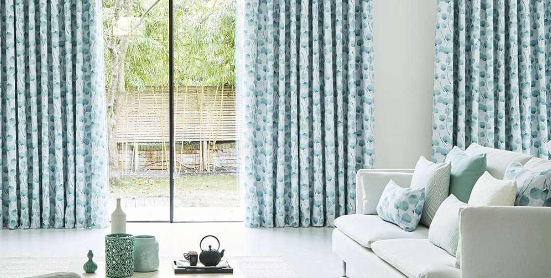
Recommended combinations:
White + light taupe
Gray + pale blue
Cream + linen texture
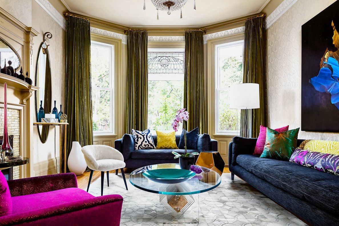
Modern Luxury Interiors
Use deeper contrasts with refined tones:
Black + warm beige
Charcoal + ivory
Navy + gold-accent fabrics
Texture is critical here.
French-Inspired Interiors
Soft elegance is the goal.
Choose:
Dusty pink + cream
Lavender gray + white
Soft blue + beige
Colors should feel airy and romantic.
Nordic and Natural Interiors
Nature-inspired contrast works best:
Moss green + sand
Wood tones + off-white
Stone gray + linen
How Color-Block Curtains Change Room Perception
Window treatments influence spatial psychology.
Making Ceilings Look Higher
Use:
Lighter upper panels
Vertical contrast
Ceiling-mounted rods
This draws the eye upward.
Making Rooms Feel Larger
Choose:
Light dominant colors
Soft transitions
Neutral palettes
Strong contrast can shrink visual space.
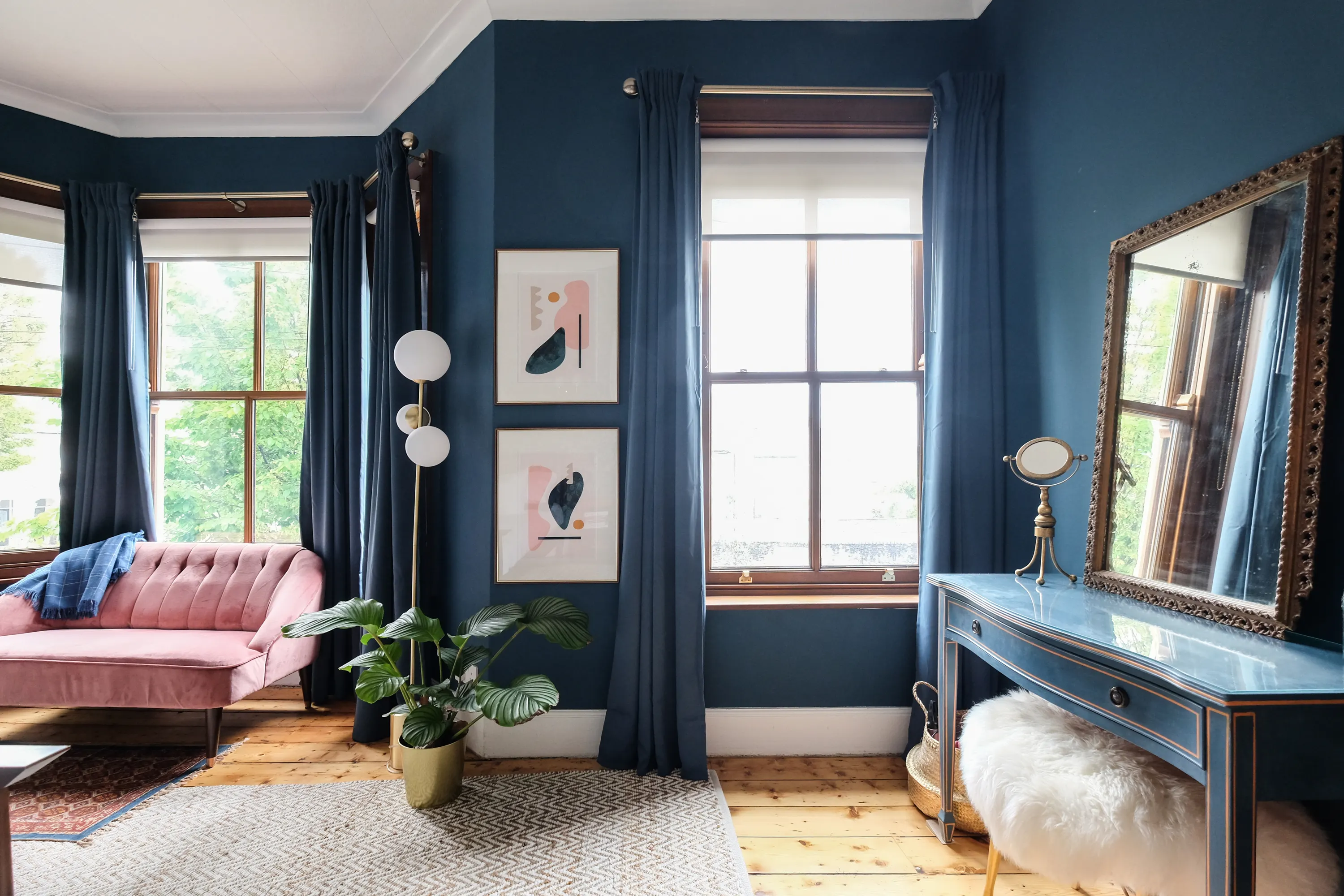
Adding Warmth to Cold Spaces
Combine:
Warm base colors
Textured fabrics
Earth-tone contrasts
Common Mistakes That Make Color-Block Curtains Look Cheap
Using Too Many Colors
Two tones are usually enough.
Three or more often create visual chaos.
Ignoring Lighting Conditions
Artificial and natural lighting alter color perception.
Always test fabric samples in your space.
Matching Curtains Exactly to Walls
Contrast should complement, not disappear.
Using Thin, Wrinkle-Prone Fabrics
Low-quality material undermines the design.
Overly Sharp Color Divisions
Hard lines can look rigid and outdated.
Soft transitions feel modern.
How to Create Designer-Level Contrast at Home
Step 1: Identify the Room’s Dominant Tone
Is your space warm or cool?
Match curtain undertones accordingly.
Step 2: Choose a Supporting Color
Pick a shade slightly darker or lighter than the primary color.
Step 3: Decide Visual Weight
Do you want:
Dramatic contrast?
Subtle depth?
Soft harmony?
Step 4: Consider Fabric Texture
Material selection determines perceived luxury.
Step 5: Test Before Installing
Hang sample fabric pieces near windows.
Observe changes throughout the day.
Are Neutral Curtains Replacing Color-Block Designs?
Neutral curtains are popular, but they serve different purposes.
Neutral designs:
Blend with surroundings
Emphasize architecture
Create calm spaces
Color-block curtains:
Add personality
Provide visual structure
Define spatial zones
Both approaches remain relevant.
Future Trends in Curtain Design
Interior design is moving toward:
Personalization
Material authenticity
Natural color palettes
Functional aesthetics
Color-block curtains that follow these principles will remain timeless.
When Color-Block Curtains Are the Best Choice
They work especially well if you want to:
Highlight large windows
Add structure to open spaces
Introduce controlled contrast
Express personal style
Balance neutral interiors
The Psychology of Color Contrast in Interiors
Colors influence mood and behavior.
Soft contrast promotes:
Relaxation
Visual comfort
Emotional balance
High contrast creates:
Energy
Attention
Dynamic atmosphere
Understanding this helps guide your choice.
Sustainable and Practical Benefits
Modern color-block curtains also support practical living.
Advantages include:
Hiding stains with darker panels
Enhancing thermal insulation with layered fabrics
Improving light control
Extending product lifespan
Design and function can coexist.
Refreshing Old Color-Block Curtains Without Replacing Them
If your curtains feel dated, try:
Changing curtain rods
Adding sheer layers
Adjusting panel proportions
Re-dyeing fabrics
Introducing complementary decor
Small updates can modernize the look.
Final Verdict: Are Color-Block Curtains Outdated?
Absolutely not.
What feels outdated is:
Poor color selection
Overly harsh contrast
Low-quality materials
Ignoring overall interior harmony
When thoughtfully designed, color-block curtains create sophistication, balance, and architectural elegance.
The modern approach isn’t about avoiding contrast — it’s about mastering it.
If your colors are harmonious, your proportions balanced, and your materials refined, color-block curtains will never go out of style.
Instead of asking whether contrast is outdated, ask:
Does the contrast feel intentional, balanced, and natural?
That’s the true definition of timeless design.
Related Products