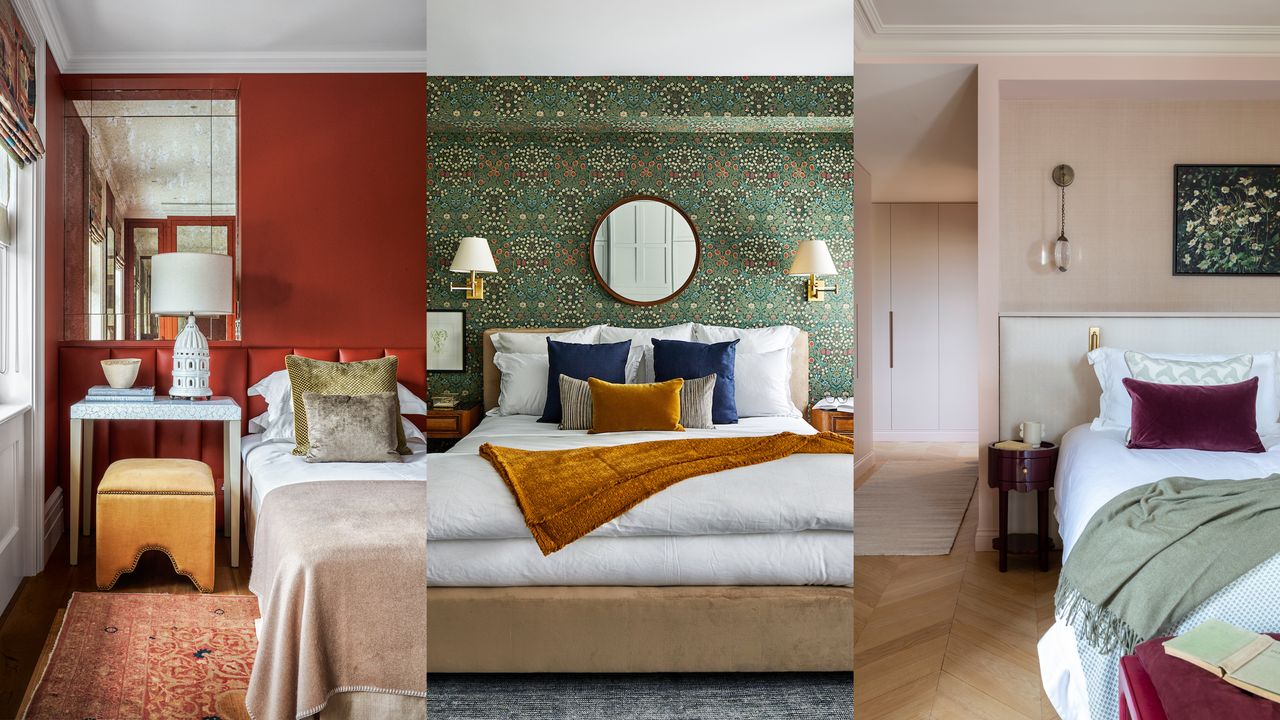
The Curtain Selection “Golden Rule”: How to Choose the Perfect Base Color Based on Room Orientation

Mar 25 2026
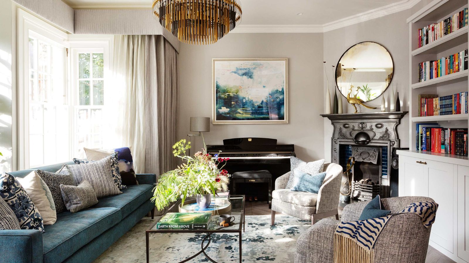
Curtains do far more than frame a window. They shape how light behaves, influence mood, balance temperature perception, and quietly determine whether a room feels calm, bright, cozy, or overwhelming. Yet many homeowners choose curtain colors based solely on trends or fabric samples viewed under store lighting—only to discover later that the same color looks completely different at home.
The reason is simple: natural light changes everything.
The direction a room faces determines the color temperature, brightness level, and shadow patterns throughout the day. A curtain color that feels soft and elegant in a north-facing bedroom may appear dull or cold in a south-facing living room. Likewise, a warm beige that glows beautifully in morning light might feel heavy and overly yellow in afternoon sun.
Interior designers often refer to orientation-based color selection as a “golden rule” because it aligns décor decisions with natural physics rather than temporary style trends.
This guide explores how sunlight direction affects color perception and explains how to select curtain base colors that harmonize perfectly with each room’s orientation, creating balanced and timeless interiors.
Why Room Orientation Matters More Than You Think
Before choosing fabrics or patterns, understanding light behavior is essential.
Sunlight varies by direction in three main ways:
- Color Temperature – warm (golden) vs cool (bluish) light
- Light Intensity – soft diffused vs strong direct sunlight
- Duration of Exposure – morning, midday, or evening dominance
Curtains act as light filters. Their base color interacts with incoming light, altering how walls, furniture, and flooring appear.
In practical terms:
- The same white curtain can look creamy, gray, or bright depending on orientation.
- Dark colors may feel elegant in one room but oppressive in another.
- Warm tones can either balance or exaggerate sunlight warmth.
Choosing the correct base color means working with natural light rather than fighting against it.
Understanding Light Direction: A Quick Overview
Let’s break down the four primary orientations and their lighting characteristics.
| Orientation | Light Quality | Color Temperature | Design Challenge |
|---|---|---|---|
| North-facing | Soft, indirect | Cool | Prevent dullness |
| South-facing | Bright, consistent | Neutral to warm | Control glare |
| East-facing | Warm morning light | Golden | Balance afternoon shadows |
| West-facing | Strong evening light | Warm/orange | Reduce heat & intensity |
Each direction calls for a different curtain color strategy.
North-Facing Rooms: Add Warmth Without Overpowering
Light Characteristics
North-facing rooms receive indirect sunlight throughout the day. The light tends to be cooler and softer, often creating gentle shadows but reduced brightness.
Common issues include:
- Rooms feeling slightly gray or flat
- Colors appearing cooler than expected
- Lack of visual warmth
The Golden Rule for North-Facing Spaces
Choose warm or neutral-warm curtain base colors to compensate for cool light.
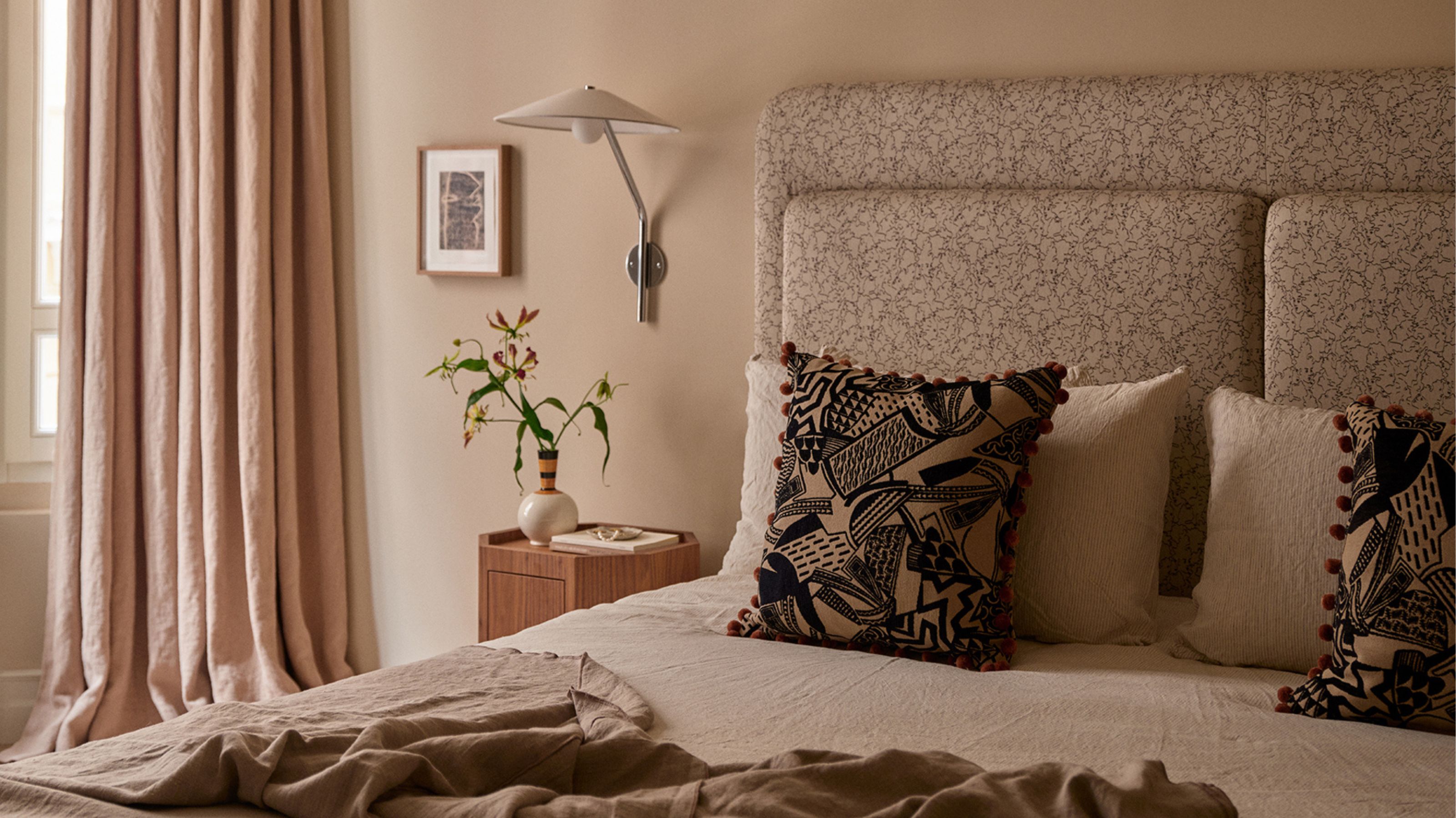
Ideal Base Colors
- Warm white
- Cream
- Soft beige
- Light taupe
- Pale blush
- Warm greige
These tones reflect available light while adding subtle warmth.
Colors to Avoid
- Blue-gray curtains
- Stark pure white
- Cool silver tones
Cool shades amplify the already bluish light and can make rooms feel sterile.
Designer Tip
Textured fabrics like linen blends enhance depth in low-light environments, preventing flat visual effects.
South-Facing Rooms: Balance Brightness with Soft Neutrals
Light Characteristics
South-facing rooms receive the most consistent sunlight throughout the day. Light is abundant and relatively neutral, making colors appear vibrant and accurate.
Advantages include:
- Excellent brightness
- Stable color perception
- Ideal for most palettes
However, excessive brightness can cause glare.
The Golden Rule for South-Facing Spaces
Use balanced neutrals that soften intensity without darkening the room.
Ideal Base Colors
- Soft ivory
- Neutral beige
- Sand tones
- Light olive
- Muted clay
- Warm gray
These shades diffuse sunlight while maintaining openness.
Colors to Use Carefully
- Extremely bright white (can cause glare)
- Highly reflective fabrics
- Intense saturated colors
Too much contrast can feel visually harsh under strong sunlight.
Layering Strategy
Pair sheer curtains with heavier drapes to allow adjustable light control throughout the day.
East-Facing Rooms: Support Gentle Morning Energy
Light Characteristics
East-facing rooms receive bright, warm sunlight in the morning followed by cooler shadows later in the day.
This creates:
- Cheerful mornings
- Dimmer afternoons
- Shifting color perception
The Golden Rule for East-Facing Spaces
Choose adaptable neutral tones that look balanced under both warm and cool lighting.
Ideal Base Colors
- Soft greige
- Light oatmeal
- Dusty rose
- Pale sage
- Warm off-white
These colors remain stable as light changes.
Why Flexibility Matters
A curtain that looks perfect at sunrise must still feel comfortable at 4 PM when natural warmth disappears.
Mid-tone neutrals prevent dramatic shifts.
West-Facing Rooms: Calm the Intensity of Afternoon Sun
Light Characteristics
West-facing rooms receive strong afternoon and evening sunlight with deep golden or orange tones.
Challenges include:
- Excessive warmth
- Heat buildup
- Harsh glare near sunset
The Golden Rule for West-Facing Spaces
Use cooler or light-neutral base colors to counterbalance warm light.
Ideal Base Colors
- Soft gray-beige
- Cool linen
- Muted blue-gray
- Stone tones
- Light charcoal (for larger rooms)
These shades visually cool the environment.
Avoid
- Orange-based neutrals
- Yellow undertones
- Deep reds
Warm curtains combined with warm sunlight can overwhelm the space.
How Curtain Base Color Affects Room Psychology
Color selection isn’t purely visual—it influences emotional perception.
Warm Bases Create:
- Comfort
- Intimacy
- Relaxation
- Coziness
Best for bedrooms and family spaces.
Cool Bases Create:
- Calmness
- Focus
- Spaciousness
- Modern aesthetics
Ideal for offices or sun-heavy rooms.
Orientation helps determine which psychological balance a room naturally needs.
Matching Curtain Colors with Wall Paint
A common mistake is matching curtains exactly to wall color.
Instead, aim for harmonious contrast.
The 60–30–10 Balance Concept
- 60% dominant color (walls)
- 30% secondary tone (curtains)
- 10% accent color (decor)
Curtains should support—not duplicate—the wall palette.
Fabric Matters as Much as Color
Light interacts differently depending on material.
Linen
- Soft diffusion
- Natural texture
- Ideal for north and east rooms
Cotton Blends
- Balanced light filtering
- Versatile for most orientations
Velvet or Heavy Weaves
- Absorb light
- Reduce glare
- Best for west-facing rooms
Sheers
- Maintain brightness
- Excellent for south-facing spaces
Base color and fabric must work together.
Seasonal Light Changes and Curtain Color Stability
Sun angle shifts throughout the year.
- Winter light is cooler and lower.
- Summer light is stronger and warmer.
Neutral-based curtain colors adapt better across seasons, preventing the need for frequent redesign.
Small Room vs Large Room Considerations
Orientation interacts with room size.
Small Rooms
Choose lighter base colors to maximize perceived space.
Large Rooms
Slightly deeper neutrals add grounding without darkening excessively.
Common Curtain Color Mistakes Homeowners Make
Choosing Color Under Artificial Lighting
Store lighting distorts tone perception.
Always test fabric samples near your window.
Ignoring Undertones
Beige may contain pink, yellow, or gray undertones that react differently to sunlight direction.
Following Trends Blindly
Trending colors may clash with a home’s natural lighting conditions.
Timeless harmony beats temporary popularity.
The Sample Testing Method Designers Use
Before committing:
- Hang large fabric samples.
- Observe morning, noon, and evening light.
- Check with lights on and off.
- Evaluate alongside furniture and flooring.
This simple process prevents costly mistakes.
Creating Whole-Home Color Flow
When selecting curtains for multiple rooms, orientation-based choices should still feel cohesive.
Use a consistent palette family:
- Warm neutrals throughout
- Vary depth instead of hue
- Maintain similar fabric textures
This creates visual continuity while respecting different lighting conditions.
Smart Layering: The Secret to Perfect Flexibility
Modern interiors increasingly rely on layered curtains:
- Sheer inner layer for daylight
- Opaque outer layer for privacy and insulation
Layering allows one base color to adapt to changing light conditions.
How Technology Is Changing Curtain Selection
Homeowners now use:
- Light simulation apps
- Smart motorized curtains
- UV-filtering fabrics
- Energy-efficient textiles
These innovations enhance orientation-based design strategies while improving comfort.
The Timeless Principle Behind the Golden Rule
Design trends evolve, but natural light physics does not.
Rooms feel harmonious when colors respond to environmental conditions rather than aesthetic guesswork.
North-facing rooms need warmth.
South-facing rooms need balance.
East-facing rooms need flexibility.
West-facing rooms need cooling contrast.
When curtain base colors align with orientation, interiors feel effortlessly right—even if visitors cannot explain why.
Final Thoughts: Let the Sun Guide Your Design
Choosing curtains isn’t simply a decorative decision; it’s an interaction between architecture, sunlight, and human perception.
The most successful homes don’t fight natural light—they collaborate with it.
By understanding how orientation shapes color behavior, homeowners can select curtain base tones that enhance brightness, improve comfort, and create emotional balance throughout the day.
The result is a space that feels naturally beautiful from sunrise to sunset, season after season—proof that the true golden rule of curtain selection isn’t about trends or rules imposed by designers.
It’s about listening to the light your home already provides and choosing colors that allow it to shine at its best.
Related Products