The Luxury Palette: Mastering Curtain Color Theory to Elevate Your Living Room

Feb 12 2026
In the world of high-end interior design, there is a concept known as "Visual Quiet." It is the feeling you get when you walk into a luxury hotel suite or a designer showroom where everything feels "expensive," yet you can’t quite put your finger on why.
More often than not, the secret lies in the windows. Curtains are the most underrated tool in your design arsenal. They occupy a massive amount of visual real estate, meaning they have the power to either anchor your design or make it feel cluttered and cheap.
If you want to achieve that "10-out-of-10" high-end look, you need to move beyond "What color do I like?" and start asking "What color creates the right architectural impact?" In this 4,000-word masterclass, we will explore the color strategies used by top-tier designers to boost the perceived value of a living room.
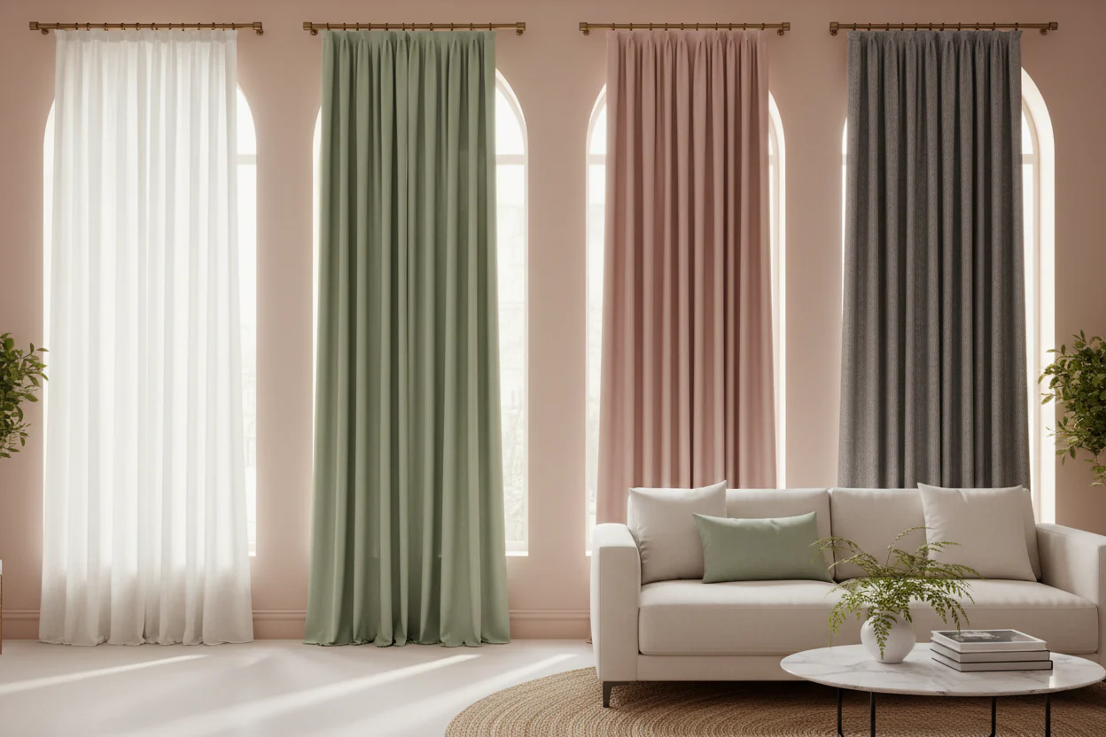
1. The "Ton-sur-Ton" (Tone-on-Tone) Strategy
The most reliable way to achieve an "expensive" look is the Tone-on-Tone approach. This involves selecting a curtain color that is in the same family as your wall color, but perhaps one or two shades darker or lighter.
Why it looks "High-End":
When your curtains blend seamlessly with your walls, it creates an uninterrupted visual line. This makes the ceilings appear higher and the room feel significantly larger. In luxury design, space is the ultimate luxury, and tone-on-tone curtains "cheat" the eye into seeing more of it.
For Off-White Walls: Choose an oatmeal, sand, or "greige" linen curtain.
For Charcoal Walls: Choose a deep slate velvet.
The Pro Move: Match the fabric color exactly to the paint color, but use a high-texture fabric like bouclé or raw silk to create depth through shadow rather than color contrast.
2. The Power of "Expensive" Neutrals
Not all neutrals are created equal. If you want your living room to scream "sophistication," you must avoid "builder-grade" beige and instead look for complex neutrals.
The "New Neutrals" Palette:
Mushroom & Taupe: These colors have a slight violet or green undertone that feels much more custom and curated than a standard tan.
Silver-Sage: A neutral with a hint of dried botanicals. It feels "old money" and pairs beautifully with brass or gold accents.
Pewter: A cool, sophisticated grey that mimics the look of high-end metals.
Design Rule: If your living room features a lot of natural wood, lean toward warm neutrals (creams, warm greys). If your room features marble or chrome, lean toward cool neutrals (icy blue-greys, crisp whites).
3. High-Contrast Sophistication: The Bold Anchor
Sometimes, "quiet" isn't the goal. In a large living room with high ceilings, you might want the curtains to act as the "anchor" for the entire space.
Implementing Deep Jewel Tones:
To maintain a high-end feel while using color, you must stick to "grounded" hues. Avoid bright, primary colors. Instead, reach for:
Midnight Navy: Pairs exceptionally well with cognac leather sofas.
Forest Green: Creates a library-like, "heritage" atmosphere.
Burnt Umber/Terracotta: Adds warmth to a modern, minimalist space.
The "High-Class" Secret: When using dark, bold colors, the fabric weight is crucial. A thin, cheap polyester in a dark color looks like a theater prop. A heavy, weighted velvet or a triple-weave wool in a dark color looks like a masterpiece.
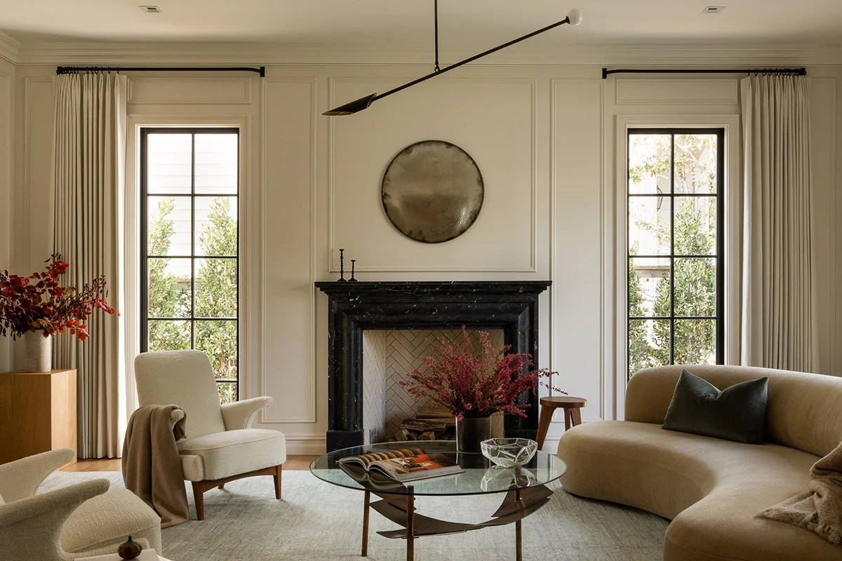
4. The "High-Hanging" Color Illusion
The color you choose is only as good as the way you hang it. To maximize the "classy" factor, designers use the "High and Wide" rule.
Color Continuity: Hang your curtain rod as close to the ceiling as possible (leaving about 2-4 inches). By using a vertical stripe pattern or a solid color that stretches from ceiling to floor, you create a "column" effect that adds architectural dignity to the room.
The Floor Kiss: For a luxury look, the color should stop exactly 1/2 inch above the floor, or "puddle" slightly (1-2 inches) if you are using silk or fine linen. Curtains that "float" 4 inches above the floor are the fastest way to make a living room look cheap.
5. Texture as Color: The "Hidden" Palette
In a luxury living room, "Texture" functions as a secondary color. A white linen curtain looks completely different than a white silk curtain because of how they reflect light.
6. Coordinating with Furniture: The 60-30-10 Rule
To ensure your curtain color elevates the room rather than clashing with it, follow the classic design ratio:
60% Primary Color: (Usually your walls)
30% Secondary Color: (Your Curtains and Rug)
10% Accent Color: (Your throw pillows and art)
By making your curtains the "30%," you provide enough color to be noticed, but not so much that it overwhelms the "60%" wall color. This balance is the hallmark of a professionally designed home.
7. The Hardware Finishes: The "Jewelry" for Your Curtains
Even the most beautiful silk curtains will look underwhelming on a flimsy white plastic rod. To finish the look:
Matte Black: For a modern, industrial, or farmhouse luxe look.
Antique Brass: For a warm, timeless, and expensive feel.
Lucite/Acrylic: For a "glam" and contemporary aesthetic.
8. Avoid the "Dating" Trap: Patterns to Avoid
If you want your living room to remain "timeless" (which is a key component of high-end design), be careful with patterns.
Avoid: Large, multicolored floral prints or trendy "chevron" patterns.
Choose: Subtle textures (herringbone, tone-on-tone damask) or simple, wide vertical stripes. When in doubt, solid colors in high-quality fabrics are the safest bet for a "million-dollar" look.
9. Final Checklist for a High-End Living Room
Does the color "talk" to the rug? (They don't have to match, but they should share an undertone).
Is the fabric lined? (Luxury curtains are always lined to provide "body" and protect the color from sun-fading).
Is the rod high enough? (Floor-to-ceiling is the luxury standard).
Is the "Fullness" correct? (The fabric width should be 2 to 2.5 times the width of the window).
Conclusion: Your Windows, Your Statement
Upgrading your living room's "class" doesn't require a full renovation. By strategically choosing a curtain color that either blends harmoniously or anchors the room with grounded, sophisticated hues, you can achieve a designer-level transformation on a modest budget.
Are you ready to select your signature shade?
Would you like me to help you create a custom color board based on your current sofa color and floor type?
Related Products