Patio Living: How Unified Cover Color Schemes Can Instantly Elevate Your Outdoor Space Aesthetics

Jul 01 2026
Outdoor living has become a defining feature of modern homes. Patios, backyards, terraces, and garden decks are no longer just functional spaces—they are extensions of interior design, places where comfort meets style, and where daily life naturally blends with nature.
Yet many outdoor spaces fall short of their potential for one simple reason: visual inconsistency.
You might have a beautiful patio set, a high-end grill, comfortable cushions, and functional storage covers—but if everything comes in mismatched colors, patterns, and tones, the overall space can feel chaotic rather than curated.
One of the most effective, often overlooked design strategies in outdoor aesthetics is color unification through coordinated cover tones. By harmonizing the colors of patio covers, grill covers, furniture protectors, umbrella sleeves, and storage tarps, you can transform a cluttered backyard into a cohesive, intentional outdoor living environment.
This guide explores how unified cover color schemes influence perception, how to choose the right palette, and how to apply design principles to elevate your patio from functional to visually refined.
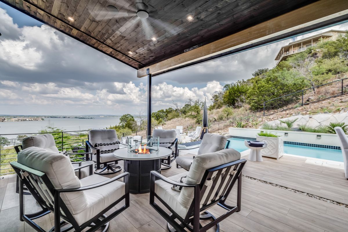
1. Why Color Harmony Matters in Outdoor Spaces
Color is one of the first things the human brain processes visually. In outdoor environments, where there are already natural variations—plants, sky, stone, wood, and sunlight—introducing uncontrolled artificial colors can easily disrupt visual balance.
When outdoor spaces lack color coordination, they often feel:
Visually fragmented
Overcrowded
Cheap or unplanned
Hard to focus on
“Temporary” rather than designed
Even high-quality furniture can lose its aesthetic impact if surrounded by mismatched protective covers or storage items.
When color is unified, however, the perception changes:
The space feels intentional
Objects blend into a cohesive whole
Visual clutter is reduced
The environment feels more expensive and curated
Outdoor zones feel like extensions of interior design
In short, color unification turns a collection of objects into a designed environment.
2. The Hidden Role of Covers in Outdoor Aesthetics
Most homeowners think of covers purely as protective accessories. They are used to shield grills, furniture, umbrellas, air conditioning units, and outdoor equipment from weather damage.
However, in practice, covers are often highly visible elements in the outdoor landscape.
They are present:
During rainy seasons
During winter storage periods
Even in daily use when furniture is not in service
Because of their size and surface area, covers frequently become dominant visual elements in the backyard.
That means their color has a disproportionate impact on the overall aesthetic.
A mismatched cover can stand out like a visual “interrupt,” while a coordinated one blends seamlessly into the environment.
3. The Psychology of Unified Color Schemes
Color coordination is not just about appearance—it directly affects emotional perception.
Neutral tones create calmness
Colors like:
Charcoal gray
Stone beige
Warm taupe
Deep brown
Matte black
These tones reduce visual noise and create a grounded, relaxing atmosphere.
Dark tones create structure
Darker colors:
Define edges clearly
Hide dirt and weathering
Add visual weight and stability
Make outdoor furniture feel anchored
Earth tones connect to nature
Natural colors:
Olive green
Sand beige
Terracotta
Moss tones
These help outdoor spaces blend with surrounding landscapes rather than competing with them.
Bright or mixed tones increase fragmentation
While vibrant colors can be fun in small accents, excessive variation in covers creates:
Visual imbalance
Distracting focal points
A less premium feel
4. The Core Principle: “Visual Silence”
One of the most powerful concepts in outdoor design is what designers often call visual silence.
This does not mean removing color entirely. Instead, it means:
Reducing unnecessary visual competition so that the space feels calm and intentional.
Unified cover colors contribute directly to visual silence by:
Minimizing contrast between covered objects
Creating a continuous visual field
Reducing scattered focal points
Allowing natural elements (plants, lighting, architecture) to stand out instead
A patio with consistent cover tones feels cleaner—even before any furniture is arranged.
5. Choosing a Unified Color Strategy for Your Patio
There is no single “correct” color scheme. The best choice depends on architecture, environment, and personal style.
Below are four proven approaches used in modern outdoor design.
5.1 Monochrome Elegance (Black / Gray Family)
This is the most popular and versatile approach.
Common shades:
Jet black
Charcoal gray
Graphite
Slate
Why it works:
Matches almost any exterior design
Hides stains and weathering
Creates a modern, premium look
Works well with metal, glass, and concrete environments
Best for:
Contemporary homes
Urban patios
Minimalist outdoor layouts
5.2 Warm Earth Harmony (Brown / Beige Family)
This approach emphasizes natural warmth.
Common shades:
Sand beige
Coffee brown
Walnut
Clay tones
Why it works:
Blends with wood decks and gardens
Creates a cozy, inviting atmosphere
Softens harsh architectural lines
Best for:
Garden patios
Rustic or traditional homes
Outdoor dining areas
5.3 Natural Green Integration
This approach merges covers with landscaping.
Common shades:
Olive green
Forest green
Sage green
Why it works:
Visually disappears into foliage
Enhances garden-centric layouts
Reduces perceived clutter
Best for:
Backyard gardens
Poolside areas with plants
Outdoor spaces surrounded by greenery
5.4 High-End Neutral Blend (Designer Approach)
This strategy combines subtle variations of neutral tones.
Example palette:
Light gray
Warm gray
Off-white accents
Soft taupe
Why it works:
Creates layered sophistication
Avoids monotony while maintaining unity
Often used in luxury outdoor design
Best for:
High-end residential patios
Hospitality outdoor spaces
Showpiece backyards
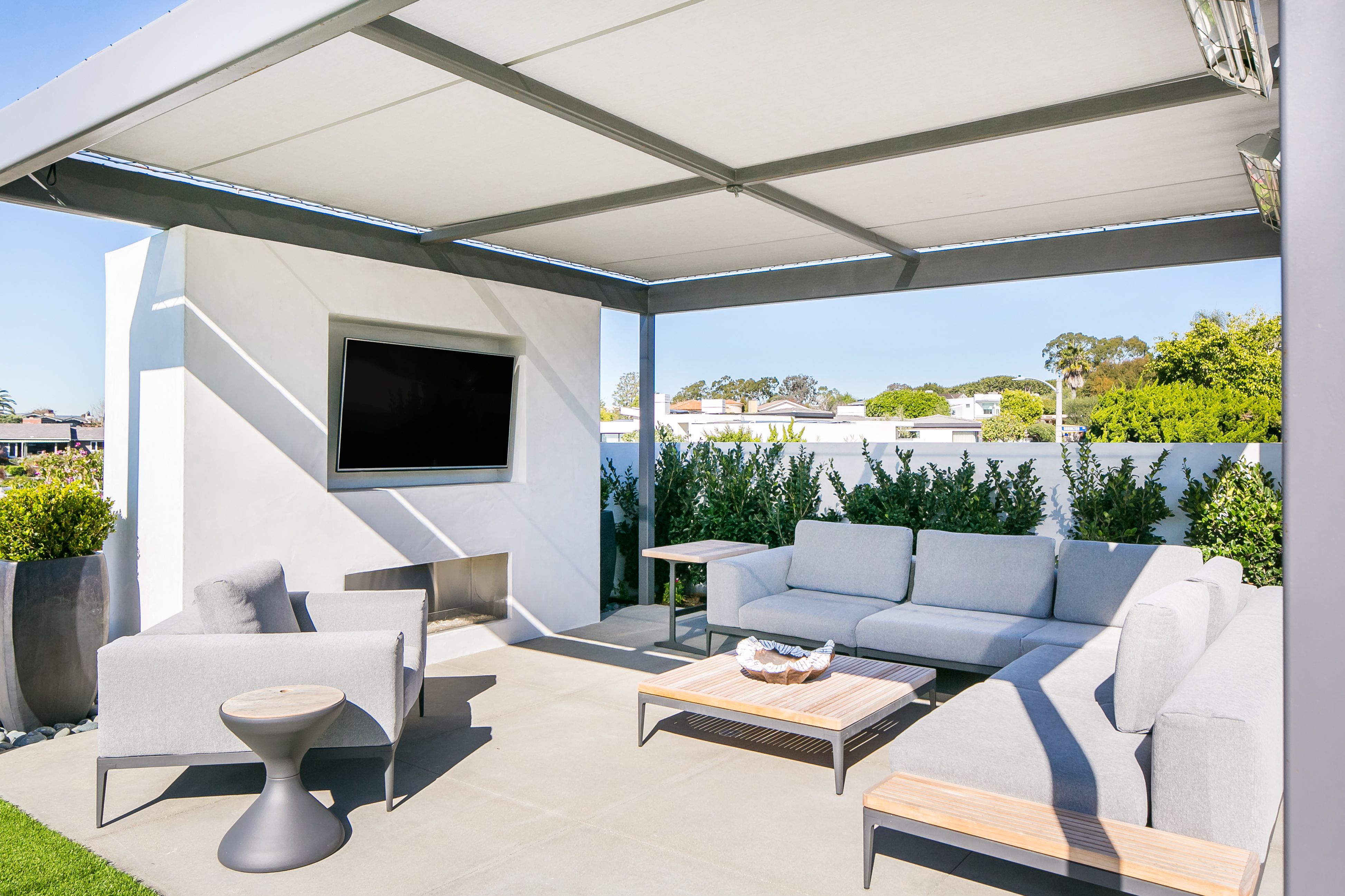
6. Matching Covers Across Multiple Outdoor Elements
A unified color strategy only works when it is applied consistently.
Common outdoor items that should follow the same color logic include:
Furniture covers
Sofas
Dining sets
Lounge chairs
Equipment covers
Grills
Smokers
Outdoor kitchens
Utility covers
Air conditioning units
Storage boxes
Water pumps
Shade system covers
Umbrellas
Pergola drapes
Retractable awnings
When all of these share a coordinated tone, the patio immediately appears more structured and designed.
7. Material Texture and Color Perception
Color is not only about hue—it is also about texture.
Two covers with the same color can look completely different depending on material.
Matte finishes:
Softer visual impact
More modern appearance
Reduce glare in sunlight
Glossy finishes:
More reflective
Can appear artificial outdoors
Show dust more easily
Fabric weave textures:
Add subtle depth
Enhance premium feel
Help neutral colors avoid looking flat
In outdoor design, matte and textured finishes are generally preferred for achieving a natural, cohesive aesthetic.
8. The Role of Light and Weather in Color Perception
Outdoor lighting constantly changes:
Morning light is cool and soft
Midday light is bright and harsh
Evening light is warm and golden
Cloudy conditions flatten contrast
This means your chosen cover colors must remain visually consistent across lighting conditions.
Practical recommendation:
Dark neutrals remain stable in all lighting
Light neutrals brighten in sun but may dull in shade
Earth tones shift subtly but stay natural-looking
Choosing adaptable colors ensures your patio remains visually balanced throughout the day.
9. Common Mistakes in Outdoor Color Coordination
Even well-designed patios can lose impact due to simple mistakes.
Mistake 1: Mixing too many unrelated colors
Too many tones create visual noise and fragmentation.
Mistake 2: Ignoring cover visibility
Covers are often more visible than furniture itself.
Mistake 3: Choosing colors based only on trend
Trendy colors may clash with long-term outdoor conditions.
Mistake 4: Overusing bright tones
Bright colors are best reserved for accents, not large covers.
Mistake 5: Not considering surroundings
A cover color that works in isolation may clash with garden or architecture.
10. Step-by-Step Guide to Creating a Unified Patio Look
Step 1: Identify dominant environment tones
Look at your home exterior, flooring, and landscaping.
Step 2: Choose a base color family
Select one primary palette (gray, brown, or green).
Step 3: Standardize all cover items
Ensure all protective covers match or complement the chosen palette.
Step 4: Limit accent colors
If needed, add only one or two accent tones in cushions or décor.
Step 5: Evaluate from a distance
Step back and view the entire patio as a single visual field.
11. Real-World Transformation Example
Before coordination:
Grill cover is blue
Furniture covers are green
Storage boxes are beige
Umbrella cover is red
Result:
Visually chaotic
No focal balance
Outdoor space feels cluttered
After coordination:
All covers unified in charcoal gray
Subtle contrast with greenery
Furniture becomes visually cohesive
Patio feels larger and more organized
The difference is immediate and dramatic, even without changing any furniture.
12. Why Unified Cover Colors Increase Perceived Value
Even if actual furniture remains unchanged, unified aesthetics:
Make spaces feel more expensive
Improve visual cleanliness
Enhance architectural integration
Increase comfort perception
Improve guest impression
This is why hotels, resorts, and luxury residences carefully coordinate all outdoor protective materials.
13. Final Thoughts: Design Is in the Details
Outdoor living spaces are shaped not just by what you place in them, but by how everything visually interacts.
Unified cover color schemes may seem like a small detail, but they have an outsized impact on the overall experience of a patio or backyard. By choosing a consistent palette and applying it across all protective and functional elements, you create a space that feels intentional, calm, and visually elevated.
In outdoor design, harmony is not created by adding more—it is created by ensuring everything belongs together.
When your patio achieves that balance, it stops being just an outdoor area and becomes a true extension of your home.
Welcome to leave a comment or contact us for a quote—we’d be happy to help you create the perfect coordinated outdoor cover solution for your space.
Need Help with Your Custom Project?
Have questions about materials, sizing, or looking for a quick quote? Drop us a message and our experts will respond within 24 hours.
Chat on WhatsApp
+1 (304) 356-6765
Send us an Email
hello@incustom.com
Picked for You